View all of the Antarctic Hemisphere daily maps of total ozone for July 2010. Satellite instruments monitor the ozone layer, and we use their data to create the images that depict the amount of ozone.
Click any map image to bring up a new page with a high-resolution map.
Data source
The data for this month are from the OMI instrument (KNMI / NASA) onboard the Aura satellite. They are the OMTO3d (Global Ozone Data) data.
Missing areas (bad orbits and polar night) are filled using assimilated ozone data from the Modern-Era Retrospective analysis for Research and Applications (MERRA) assimilation, produced by the Goddard Earth Observing System Data Assimilation System (GEOS DAS). MERRA uses a version of the GEOS model with the Gridpoint Statistical Interpolation (GSI) atmospheric analysis developed jointly with NOAA/NCEP/EMC.
July 2010
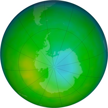
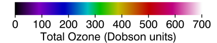
The false-color view of the monthly-averaged total ozone over the Antarctic pole. The blue and purple colors are where there is the least ozone, and the yellows and reds are where there is more ozone.
Calendar
A week begins with Sunday. Fainter images are shown in the previous and following months. Missing days are indicated with a plain gray globe.

|

|

|

|

|

|

|
| 27 | 28 | 29 | 30 | 1 | 2 | 3 |

|

|

|

|

|

|

|
| 4 | 5 | 6 | 7 | 8 | 9 | 10 |

|

|

|

|

|

|

|
| 11 | 12 | 13 | 14 | 15 | 16 | 17 |

|

|

|

|

|

|

|
| 18 | 19 | 20 | 21 | 22 | 23 | 24 |

|

|

|

|

|

|

|
| 25 | 26 | 27 | 28 | 29 | 30 | 31 |
Map archives
Monthly averages (1979–current)
Daily
- 1995
- January
- February
- March
- April
- May
- June
- July
- August
- September
- October
- November
- December